
The Scissors, the Shells, the Slightly Bloodied Lavender
On the cover of Dye by Design

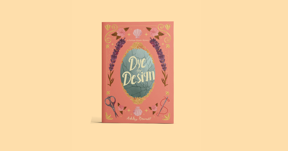
The scissors on the cover of Ashley Brandt’s Dye by Design are tipped with a small bloom of pink. Not blood, exactly. Not not blood, either. If you look closely at the gold frame around the central mirror, you’ll see the same flecks. None of these details shouts. All of them whisper.
This is what a good cover does. It tells you what kind of attention the book is about to ask for, before you’ve read a word.
Dye by Design is a paranormal cozy mystery set in small-town Alabama, where a shy, bookish woman named Berlynn Wallace works at a beloved independent bookstore and navigates small-town murder investigations with the help of a flamboyant ghost who was once a fashion designer. The book is gentle. It is warm. It is also, occasionally, a little bit about murder. The cover had to hold all of that at once.
We could have asked stock photography to do that work. We didn’t.
Instead, we commissioned an illustrated, hand-painted cover, centered on an ornate gold-framed mirror, its surface cracked just enough to hint at what lies beneath the charm. Sweeping lavender stems flank the mirror on either side. Pink florals and shell motifs fill the border, gesturing at Fairhope’s coastal Alabama setting. In the lower corners sit a pair of antique silver scissors and a needle threaded with vivid red, quiet nods to the fashion world at the heart of the story.
Each object on this cover earns its place. Nothing is filler. Even the cracked mirror, beautiful in its own right, is also the oldest paranormal object in fiction. The surface through which the unseen becomes visible. For a series whose protagonist sees a ghost no one else can, that wasn’t an accident. (The broken mirror was Ashley’s idea. Some of the best cover decisions come from the writers themselves.)
The temptation, especially for an indie press, is to treat a cover as marketing. A surface. The thing you put in front of the book to get it picked up.
But a cover is also the first sentence of the book, written in a different language. It tells the reader what kind of world they’re walking into, what tone the writer struck, and how much care has been taken with everything they can’t yet see.
Dye by Design asks for a particular kind of reading: gentle, observant, willing to notice the bloom on the scissors. We wanted the cover to ask for the same.
Dye by Design publishes May 12. Pre-orders open now at sutrahouse.com.